Digity Create New Website for the Military Wives Choirs
This blog post was written by:
Caitlin Davis • December 22, 2020
We're thrilled to have produced a new website for the Military Wives Choirs, helping with their mission to 'Sing, Share & Support' and accompanying the launch of their new movie this year.
Their old website was rather outdated, having been created quite quickly and some time ago. This meant that it was incredibly hard to update, and therefore the information, messaging and imagery present on the site was not all necessarily accurate. Additionally, keeping their community up-to-date with recent news was notably difficult, due to their blog section being troublesome to update.
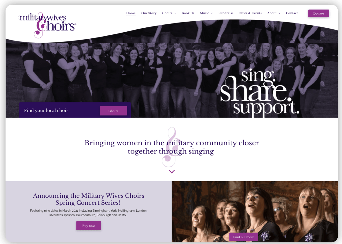
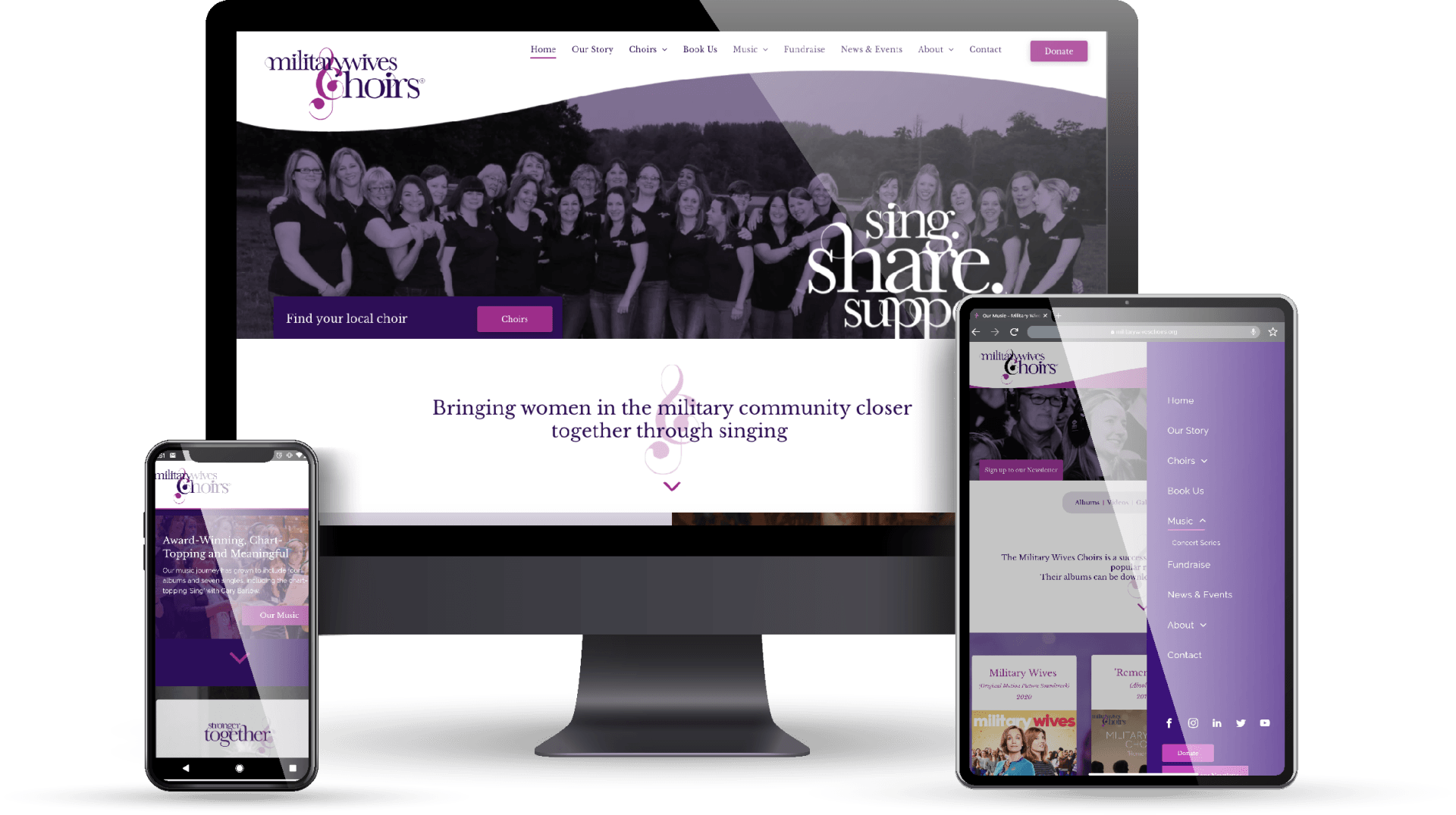
They came to Digity looking for a fresh new website, which would look more minimalistic than their old content-heavy website, but still be extremely informative and easy to use for all visitors. Their choirs consist of members of all ages, so it was vitally important to them that no one should find their new site complicated to navigate. They also wanted to emphasise that they are a group of highly-talented choirs available for booking, by making it much easier for both local and national events to initiate the booking process.
This website project was an extremely exciting project for the team at Digity, and one that we were determined to do justice - the passion of the Choirs Support Team at Military Wives Choirs was infectious and heartwarming. The great relationship we established was key, as the regular communication between both parties kept the project on schedule and contributed to a successful collaboration.
She said of the design process, “We wanted to make the most of full-width design and try to steer away from standard layouts to make the site more interesting and modern. We used the curves to continue the feminine feeling of their branding throughout the site.”
As for navigation and ease-of-use, Alix noted, “We wanted to make the journey as easy and possible for people to find their way where they needed to go on the site. It caters for a lot of different audiences, and so we worked hard to get this site to appeal to all groups. “
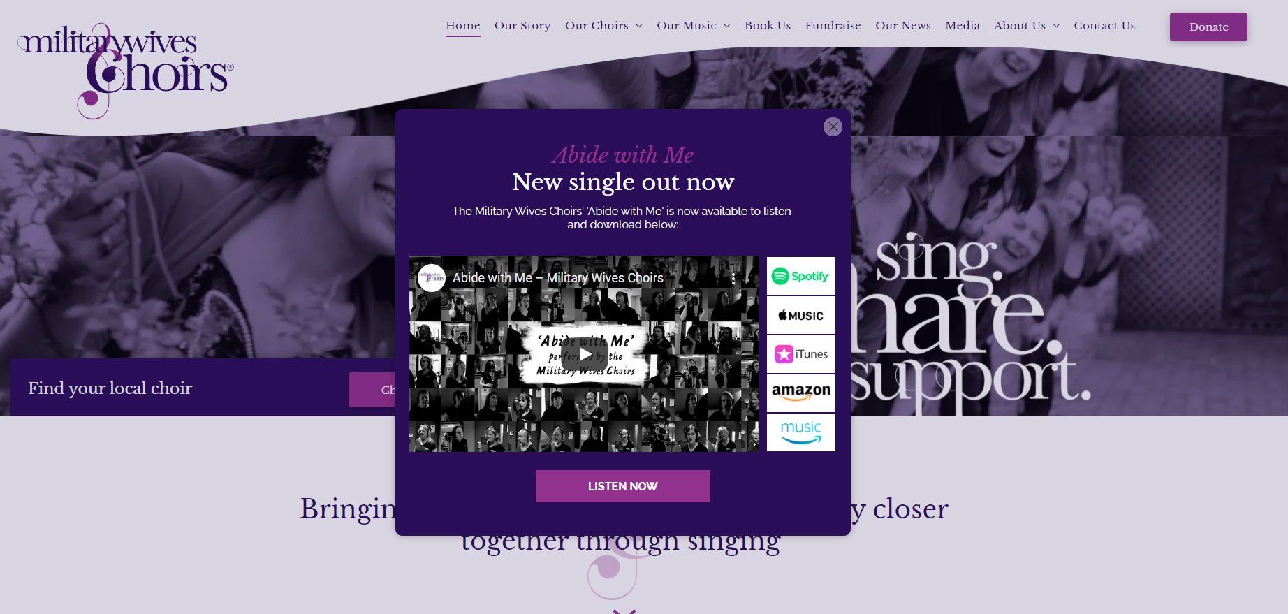
The site carries over the old site’s colour scheme and the MWC branding of purple and white, but different shades are utilised to create a more modern effect, and add depth and visual appeal. Our designers created a number of graphics and icons to help tell a more visual story of the Military Wives Choirs messaging, such as the ‘Our Story’ section, which details the history and growth of the choirs.
Alix explained, “The ‘Our Story’ section, which was previously a text-heavy pdf, is now a timeline to show the evolution of the choirs. Visual features such as these are common throughout the site; we wanted to use images frequently as the real appeal of MWC is the choirs themselves, and so all the images are shots of real MWC members in performance, recording or rehearsal. This gives a wonderful personal touch to the site, showing women from all these different backgrounds and enabling a potential member to see themselves being part of the MWC family.”
The Military Wives Choirs is not only a charity, but a creator of award-winning and chart-topping music. It was one of their wishes that this would be more clearly emphasised and presented, so we developed a new ‘Music’ section for them, creating an area to showcase their discography as well as videos and performances. They have some truly fantastic content, so we ensured that it would be easy for people to access it and share in the power of their music.
She thanked the team for their work, remarking,
“You have delivered a project that speaks to all our many and varied audiences whilst keeping to the original brief and remaining on time and on budget. This is a remarkable achievement at any time, but to deliver in these very challenging times, is a testament to your clarity of vision and excellent project planning and delivery processes. Thank you again.”
Take a look at the new Military Wives Choirs website here,
where you can also find ways to donate to or fundraise
for their charity.
If you are interested in our digital marketing and website services, book a free initial consultation to allow us to pinpoint the specific areas you could be exploring to help your business thrive.
Let’s make your marketing work properly
If your marketing is active but not delivering, something isn’t aligned.
We’ll help you identify what’s wrong and fix it.
Start the conversation:
We'll be in touch soon. No hard sell, just a focused conversation about where you are and what’s possible.
All responses are handled in line with our Privacy Policy.
Digity Ltd
Tel: 01189 100 456
Venture House, Arlington Square
Registered in England and Wales, no. 05657294.